Triptych
- 1489109
- Nov 14, 2024
- 1 min read
Landscape
3 photos of different landscape photos
I think its kind of a Triptych because its 3 photos with the same ideas
I used space in these photos because their is lots of positive space in these photos
i used emphasis in these photos because the viewers eyes are drawn to it
the rule of photography i used is be creative with the colour

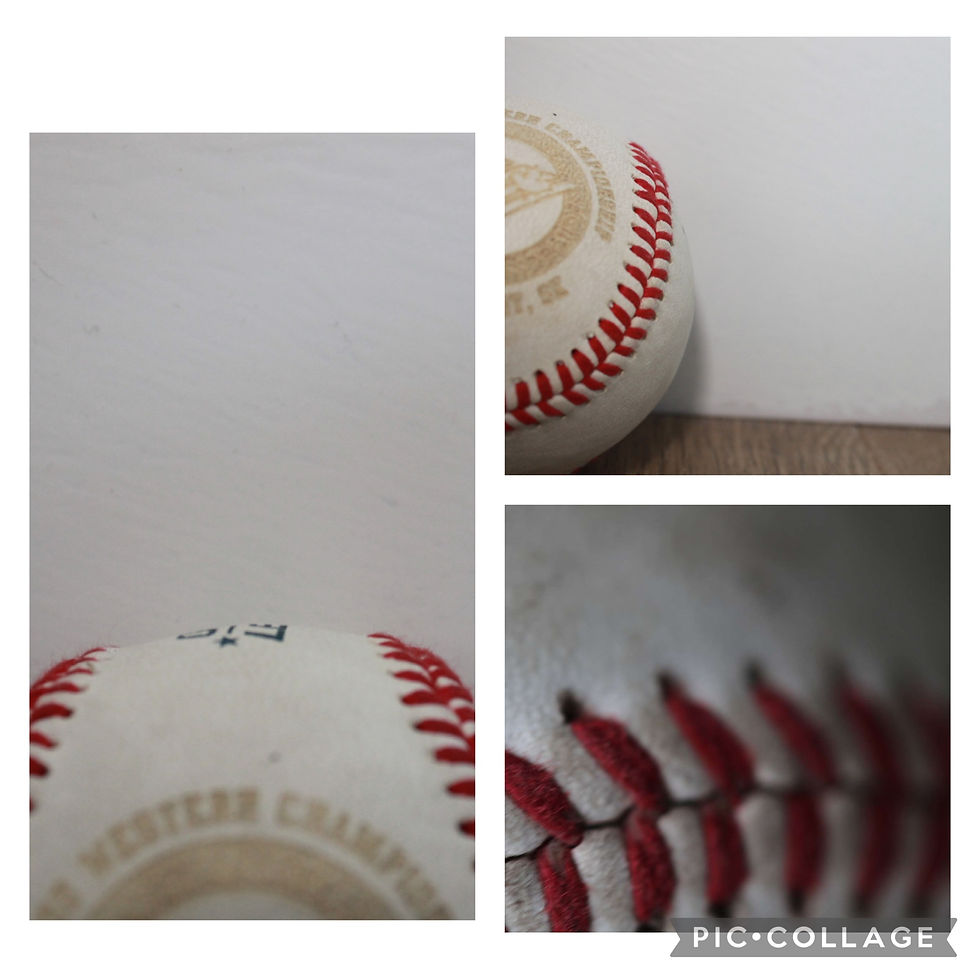
angles of a baseball
3 different angles of a baseball
yes I think this is a success
I used texture in these 3 photos
I used emphasis in these photos because it don't matter where the ball is
i used both fill the frame and avoid the middle

Head angles
3 different head angles
yes this one is definitely
i used negative space in these photos
i used emphasis in these photos because of how close my dog is
i used fill the frame in these photos


Comments